B2C Marketplace
E-Commerce Platform Redesign & European Entry
Summary
Remember Flash Sales? Well, hot on its toes is off-price fashion and more specifically, leading off-price fashion marketplace Secret Sales. I was brought in to lead the complete end-to-end redesign, collaborating with stakeholders across the business and driving UX strategy from discovery through delivery.
With its outgoing business model, flash sales, Secret Sales struggled with a plethora of issues on platform including:
- Low conversion rates (1.2% on desktop, 0.6% on mobile).
- Cumbersome CMS workflows that made uploading inventory slow and error-prone.
- Poor international scalability – the platform was UK-only, limiting commercial growth.
My Approach
Let's begin with Discovery
I began the Secret Sales redesign with a series of stakeholder workshops to clarify core business objectives, which included European Market Entry, increasing conversion rates and strengthening brand partnerships. To ground these goals in real user needs, I conducted remote user interviews with both existing and potential customers across the UK and EU, uncovering pain points around product discovery and checkout friction.
Alongside this, I carried out competitor benchmarking, analysing platforms like Net-a-Porter, ASOS and Farfetch to identify UX standards and opportunities for differentiation. Finally, an analytics review helped map user flows and pinpoint critical drop-off points.
Determining UX Strategy
Limited resources across key business functions, minimal delivery times and incredibly tight budgets meant the UX strategy needed to be robust and effective from the off. Here's how the UX strategy looked.
Consistency acoss devices
60% of traffic was from a mobile device so it was key to ensure consistency across devices and browsers.
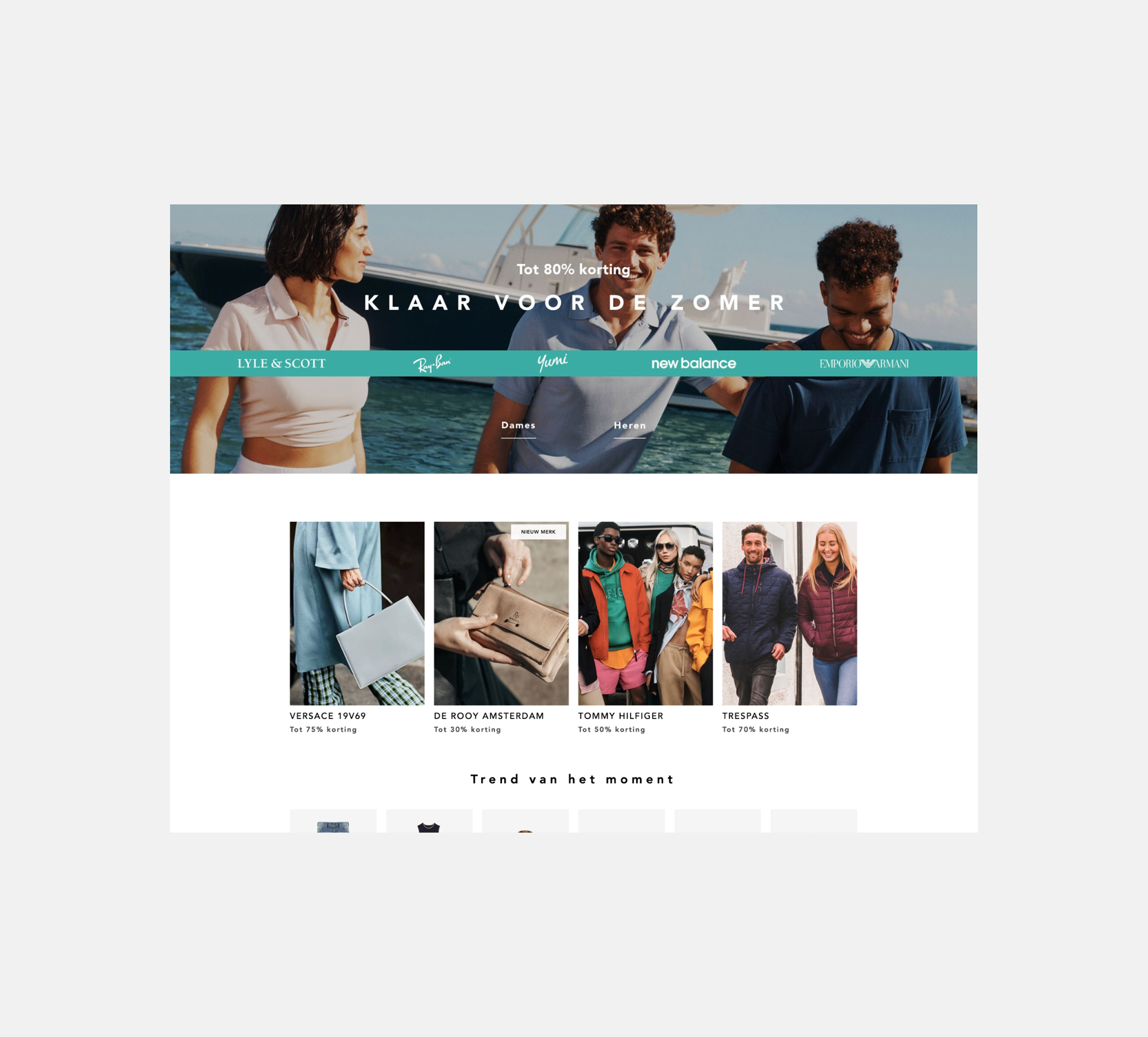
Localisation & Internationalisation
Designed frameworks to support multiple regions, languages and currencies.
Payment Flexibility
Integrated Klarna and Clearpay to meet user demand for flexible checkout options.
This contributed significantly to improvements in avg basket value.
CMS Simplification
Worked with engineering to introduce Magento to sit as the foundation of the site allowing for easier inventory managament and product tagging.
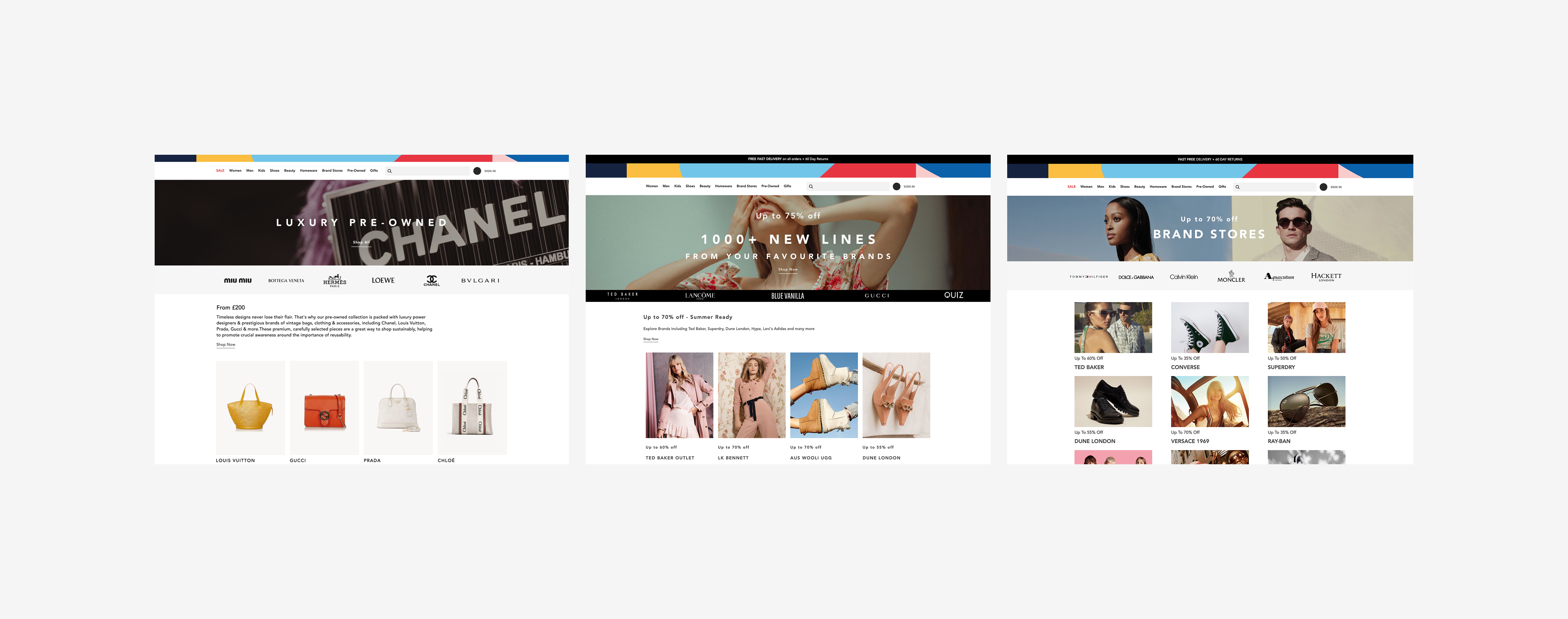
Brand Stores
Introduced customisable brand storefronts ( Adidas, Coach, Channel + many more) to drive brand equity and commercial opportunity.

Design Execution
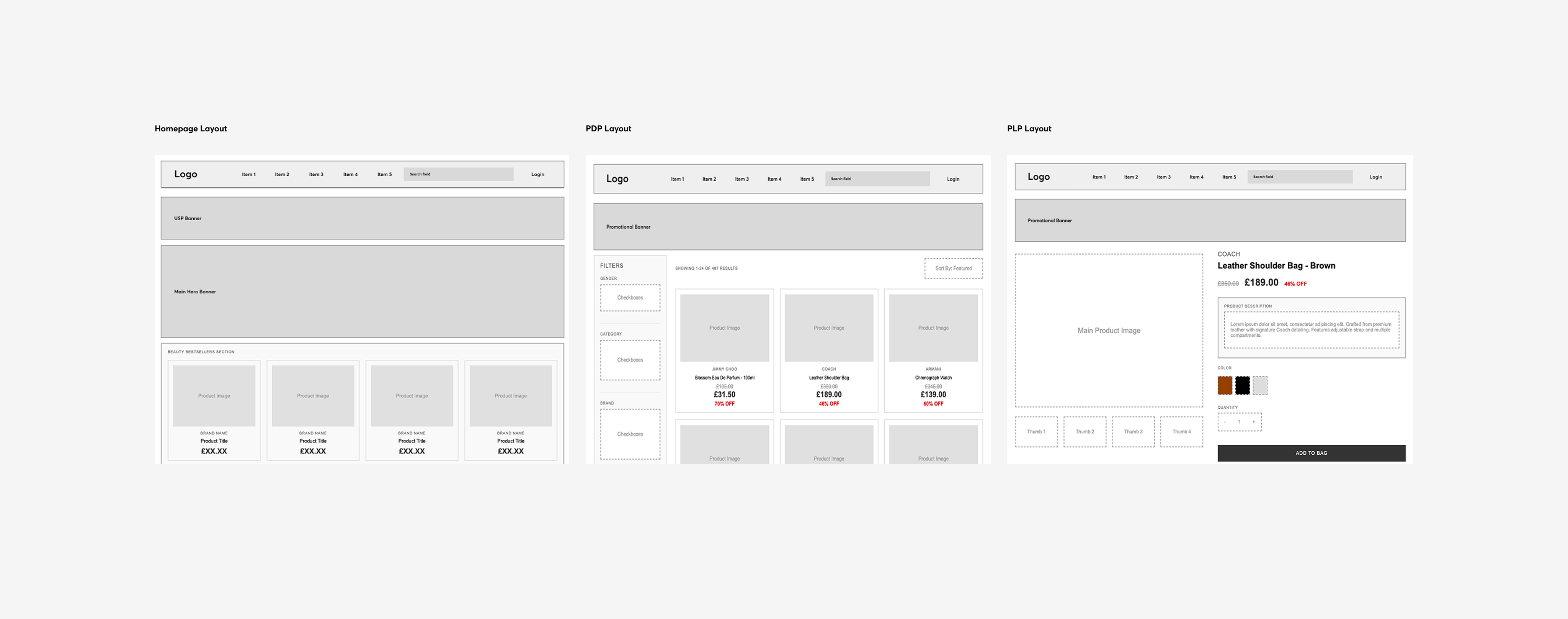
A key part of the redesign was rethinking the information architecture, ensuring the navigation was intuitive and aligned with customer expectations. I reorganised the site structure to better surface categories, seasonal categories and brand stores, making product discovery quicker and more engaging. On the product pages, I introduced richer imagery, delivery estimations, dynamic pricing, and clear size availability to help customers make more confident purchase decisions and reduce return rates.
To support scalability, I established a design system (This is a must) that ensured consistency across the platform while enabling faster design and development cycles. Finally, I Implemented data-driven design improvements to the checkout flow, reducing friction points, cart abandonment and directly increasing conversion rates.

Validation
Validation was built into the process from the start. I ran iterative rounds of usability testing with customers in the UK, Germany and France (Part of European Market Entry), ensuring that localisation, language preferences and region-specific behaviours were fully considered. Insights from these sessions directly informed improvements to search filters and navigation flows.
In addition to this, I rolled out A/B testing using Monetate across key areas of the site, including homepage and product personalisation. This apporach provided data-driven evidence of design improvements, allowing us to continuously refine the user experience and optimise for conversion at scale.

Results
Contributed to enabling expansion into new markets and generating £1.4M in additional revenue
Grew from 15 brands → 500+, thanks to easier onboarding and brand store customisation.
25% reduction in customer service queries related to checkout and product search.
Conversion Rates
Mobile: 0.6% → 1.8% (3× increase)
Desktop: 1.2% → 2.4% (2× increase)
Reflection
This project was one of the most commercially impactful redesigns I’ve led. It balanced business goals (European market entry and growth) with user needs in an ever advancing e-commerce market.
I’m proud to have set the UX strategy and proven how design can directly drive revenue growth at scale-ups.
Let's Talk
If you have a project you would like to discuss, fill out the form and I'll get back to you shortly.